MFA Form Automator
Web app design

About the project (ongoing)
As a UX designer at Sandbox , Northeastern's student-led software consultancy, I collaborate closely with software developers to craft a web application that streamlines the transfer of forms within Boston's Museum of Fine Arts (MFA). We strive to infuse creativity and innovation into the design process while ensuring practicality and feasibility. Our goal is to deliver a user-friendly, efficient tool that aligns with our client's objectives.
Roles
UX designer (January 2023 - December 2023)
Project lead (January 2024 - present)
PROBLEM
(My comments will go under here!)
Background
Currently, the paper forms that the MFA manages are passed between departments and positions in envelopes to get necessary signatures and approvals. I mean, it works. But it's definitely not the most efficient system.
So, as a team of software developers and designers, our job is to build a dashboard that allows for a fully-digital workflow for completing forms. Employees will be able to log into the website with their MFA credentials, view any requests for signatures/approval that have been made, and edit the relevant form within the portal. Admins will be able to perform these functionalities, as well as create forms and assign employees to sign forms. Once an assignee signs a form, the originator of the form and the next assignee in the chain will be notified.
This project was completely new when I joined the team. In the very beginning, we were just given the problem, then had to figure everything out from there.
PROCESS
Mapping out the user flows
Our users fall into two categories: employees and admins. Employees will solely use this web app for signing forms, and admins have the added responsibility of creating form templates and form instances. This diagram maps out the web app's structure and illustrates how employees and admins will navigate it to complete their respective tasks.
This diagram served as a reference for the web app's navigation, which was a helpful reminder when things were getting more complex.

Lo-fi wireframes
The initial step for designing each page involved creating lo-fi wireframes. Mapping out the layouts at a basic level helped us strategically design how users would interact with the interface. The wireframes also allowed us to get client feedback during the early stages of the design process.
Below is the evolution of the main dashboard page's lo-fi wireframe, displaying the most recent forms categorized by status (to-do, pending, and completed). Our goal was to provide users with relevant information at a glance, while avoiding unnecessary clutter.

Establishing visual identity
Building off the MFA Boston's existing visual identity system, we developed a version customized specifically for this web app.


SOLUTION
Dashboard
On the main dashboard, employees can see their latest forms, presented as cards with the form name and assignees of that form. They can also switch to a list view, where the forms are categorized by status.

View a form
On an individual form page, employees can see where they are in the order of assignees, and sign the form when it's their turn.

Create a form template (admin)
Think of a form template as the skeleton of a form.

Create a form instance (admin)
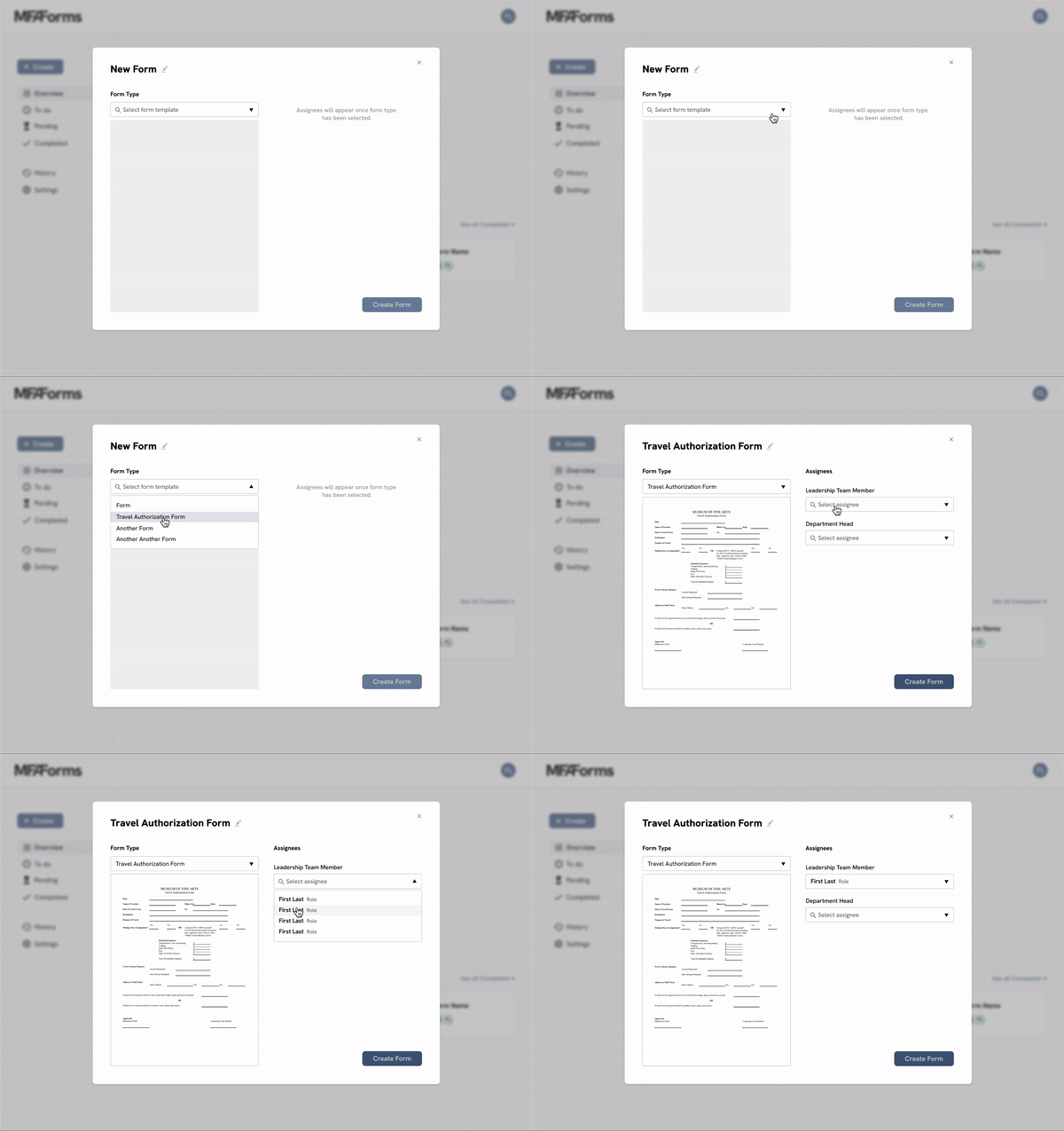
A form originator can create a form by selecting from existing templates. Role titles for each required signature will be displayed, and the originator will choose an assignee from the dropdown menu.

This project is currently in progress!